WATER BOTTLE | ÁGUAS DO PORTO, EM
DESIGN CONTEXT - DEVELOPMENT OF A WATER BOTTLE | ÁGUAS DO PORTO, EM
It was sunny, we were going to throw bottles into the sea. We wrote messages to strangers, asking for luck and gifts, asking for visits. We told silly stories and confessions, we were full of hope that someone would answer us. Hidden away, so we wouldn't be charged for the stolen bottles and the carelessness of throwing things into the water, we offered our secrets. And it was true that we filled the bottles with flowers, because we wanted them to be little gardens to take away with us.
Valter Hugo Mãe
Water is a fundamental element for life. Promoting its regulated and responsible consumption, and contributing to the promotion of effective water quality in public networks, is a common requirement for all socially committed people.
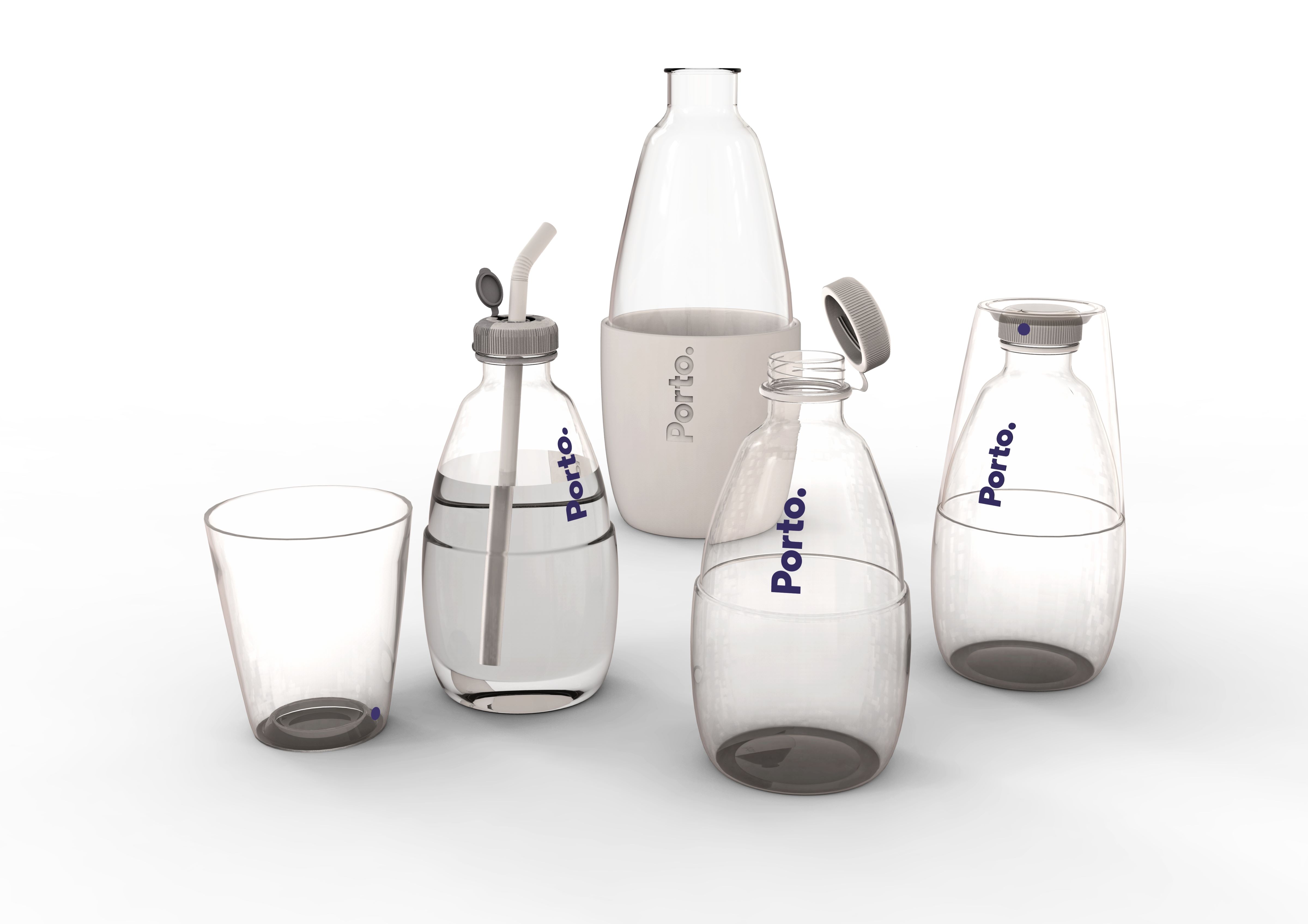
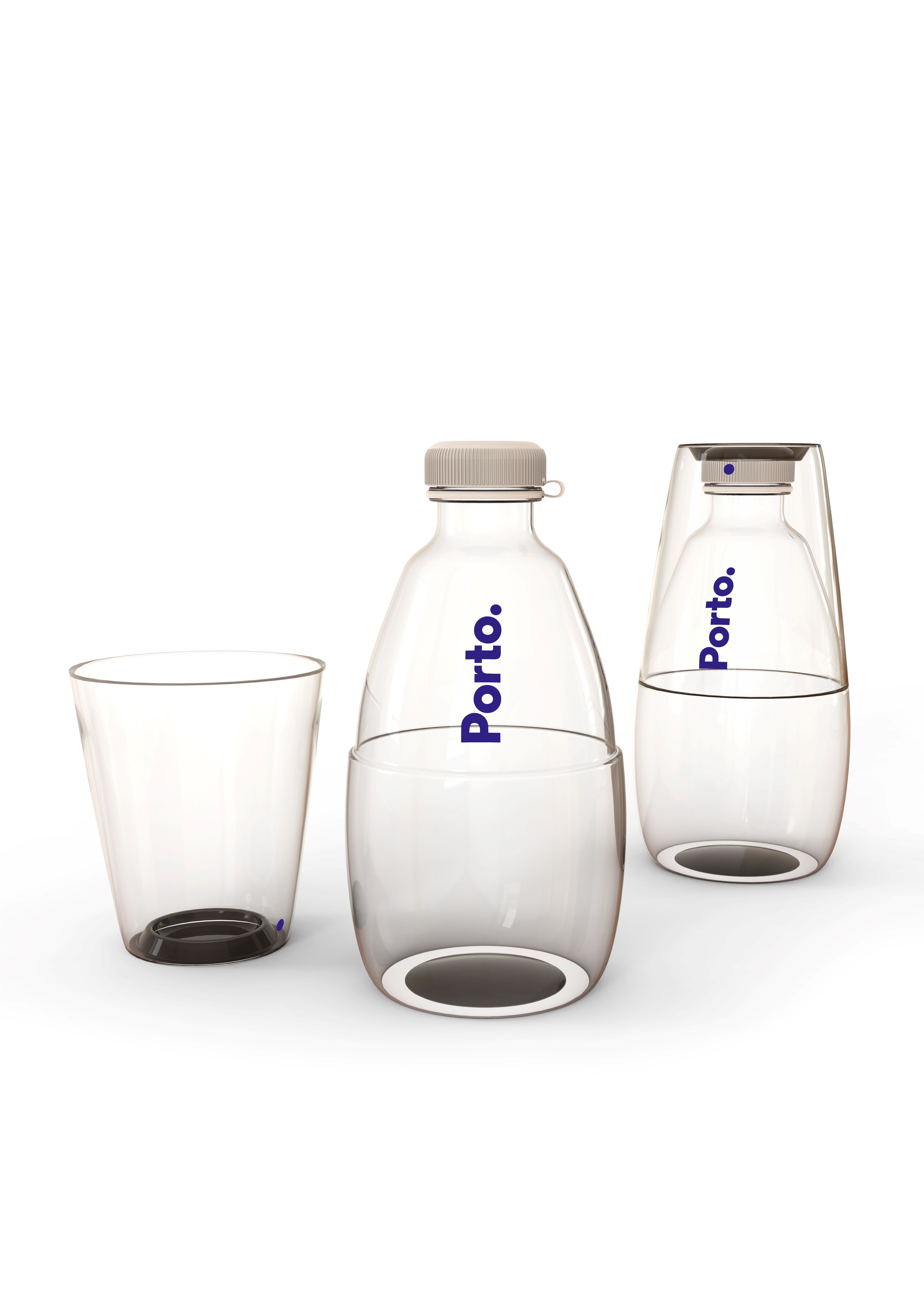
In this regard, the two bottles that are the subject of this competition seek to meet the demands of an age, social and culturally diverse population, essentially in situations where portability is required – 0.5l bottle – but also for use at the table, during meals or in other sedentary circumstances – 1.5l bottle – in order to promote the use of tap water for drinking.
The different needs of potential users of the 0.5l bottle required a response to the following anticipated situations:
– for drinking water in more informal situations, from the neck of the bottle: a cap that can be opened/closed by screwing, which is attached to the bottle by a ring;
- for drinking water from another container, in order to avoid contact between the mouth and the bottle, which is more hygienic: a cup that attaches to the bottle, allowing the set to be transported;
- for more inclusive situations, for use by children or people with motor difficulties: a ‘second’ cap that allows the use of a straw;
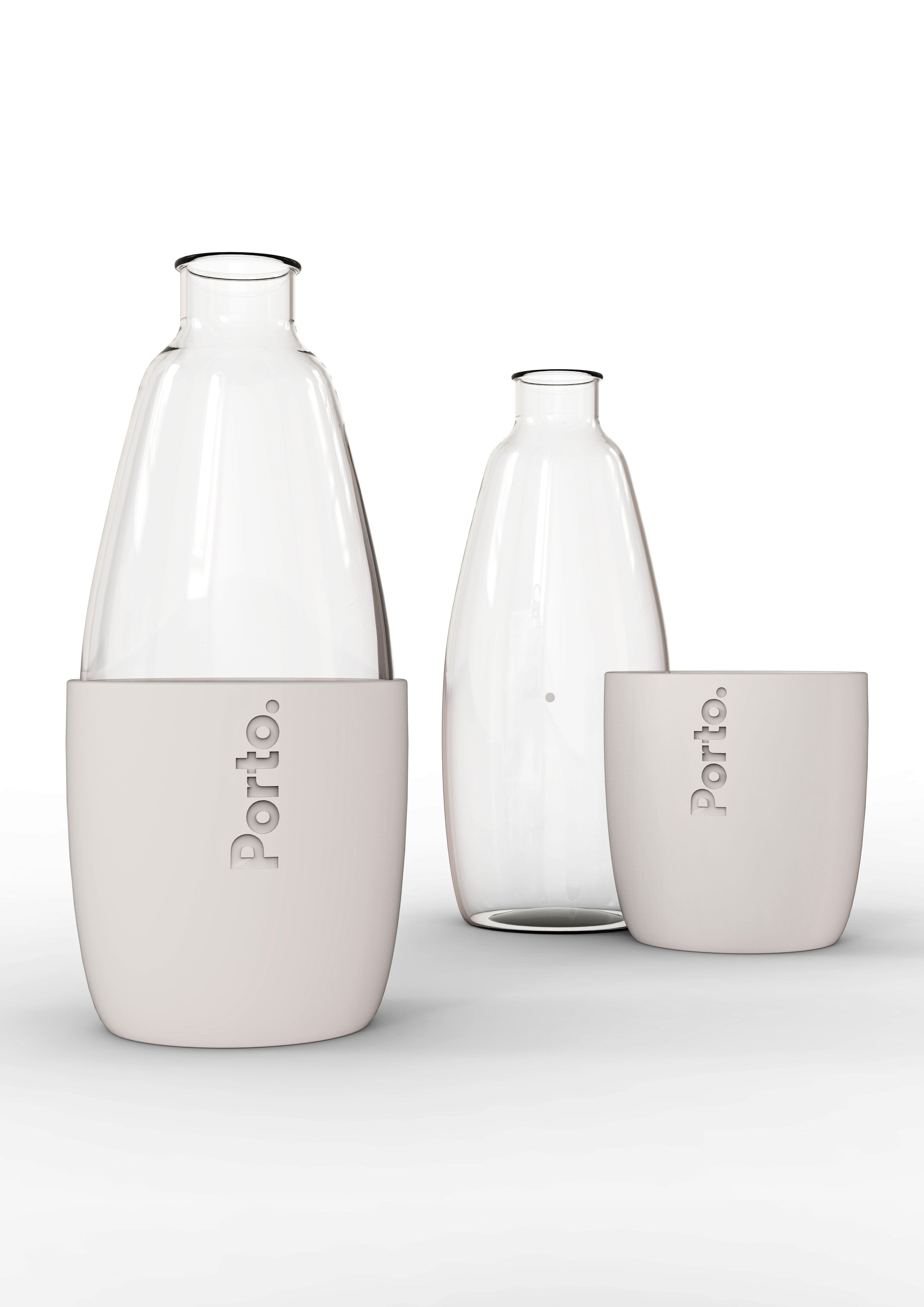
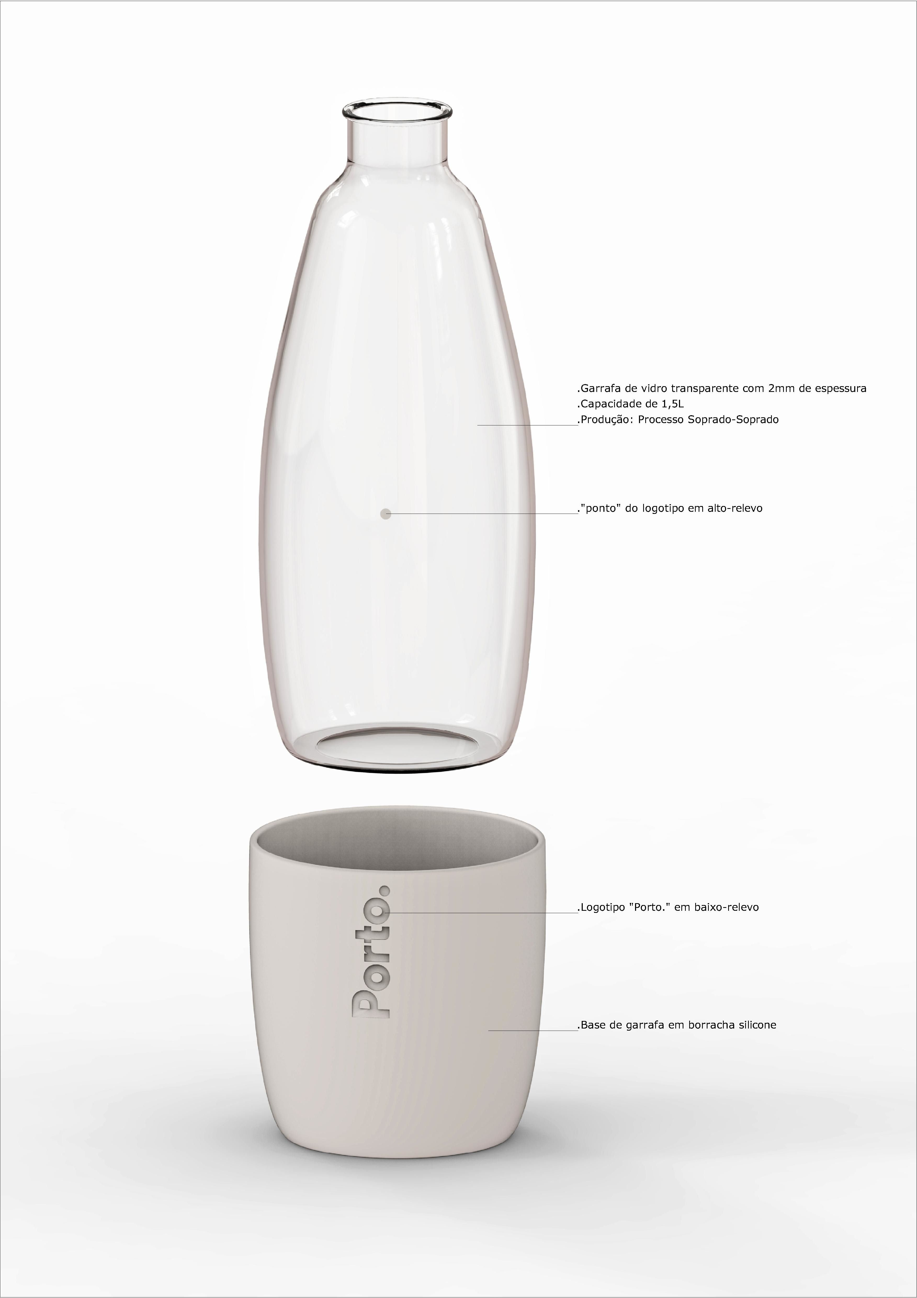
The proposal for the glass bottle, potentially used in more classic situations, aims to invoke a certain sophistication in the gesture of serving water with the bottle + base set; the base is also a container with isothermal characteristics that helps maintain the temperature of the water.
For the inscription of the brand name ‘Porto.’, the phonetic characteristics of the ‘porto ponto’ logo itself were used; on one of the pieces of each set, ‘Porto.’ is written at the top, while on the other piece of the set, the graphic element that is immediately associated with the logo can be seen: the DOT.
- Architecture: Paulo Seco (em co-autoria)
- Collaboration:
- Location: Porto
- Project: 2015
- Construction:
- Image Copyright: